Tuesday, July 24, 2012

Quick Forecast

The next four slides are from the Storm Prediction Center

Severe storm probability

Hail probability

Tornado probability

Damaging wind probability


Basically, when you are in this red box below, this is when the low level jet is in a position to generate a strong to severe thunderstorm over you. Storms may produce damaging winds today, with hail and weak, isolated tornadoes being a secondary risk for areas on the right side of the box. The original wind profile for the 700mb level is from twisterdata.


Wednesday, July 18, 2012

Why has it been so warm?


I think it is important to introduce the main game players here. The first would be the El Nino Southern Oscillation (ENSO). For those of us new to the climate world, ENSO is a sea surface temperature anomaly in the Pacific Ocean induced by both 1)Oceanic currents 2)Atmospheric wave patterns. Shown below is the Multivariate ENSO Index (MEI), which takes into account several variables for the ENSO phase. Red = El Nino Blue = La Nina. Neither pattern has a significant climatological change on AVERAGE temperatures; indeed there have been very cold La Nina winters (1959-1960) and very warm La Nina winters (2011-2012). A La Nina allows for a more meridional flow though, which translates to a wider range of temperatures.

Remember the 2009-2010 Armageddon winter; it may have been very cold and snowy, but it was CONSISTENTLY cold and snowy. The winter after (2010-2011) is remembered for it's abrupt start and it's even more abrupt finish.


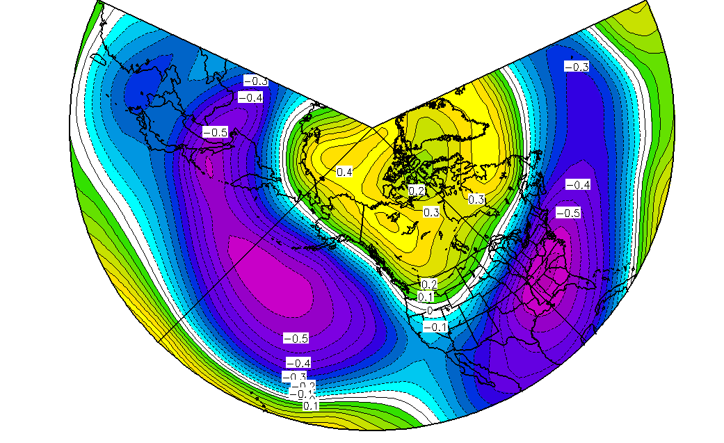
We get to our second player, the Pacific Decadal Oscillation. As its name suggests, it exists on a multi-year scale. Shown below is an image from Wikipedia depicting a positive (warm phase) of the PDO. This is a sea surface temperature anomaly. A negative phase of the PDO would be very conducive for warmer weather across the Southeast. Note that both the 2010-2011 and 2011-2012 winters were a negative phase PDO. But 2010-2011 was a far cry from the near record low of 2011-2012 winter.


Dec - Feb 1980 - 2010 PDO correlation to 500mb height levels
The negative event of 2010 - 2011 was weak enough to be overpowered by another variable, the Arctic Oscillation, thus giving us a very cold start despite the unfavorable conditions in the Pacific. But in 2011-2012, the PDO was much stronger and limited the number of cold air outbreaks we received. Switching gears away from the 2011-2012 winter, we go to this summer.

Dec - Feb 1980 - 2010 PDO correlated to temperatures.
This is why we never stood a chance for a cold 2011-2012 winter.


Summertime PDO correlated to geopotential height. Note that we are still within a negative phase of the PDO.


Summertime PDO correlated to temperatures. Note that we are still within a negative phase of the PDO.

Summertime PDO correlated to zonal winds. This actually fits what we have seen so far: a lack of a subtropical jet influence over the Southeast and a stronger zonal flow over the northern tier of the United States.
 The equalizing factor. We have been moving towards a weak El Nino (started off with a La Nina spring). The zonal flow into the Pacific Northwest and over the northern tier of the United States is weakened during an El Nino.

 Put the -PDO with an El Nino and the effects start to cancel out. However, since there is a lag for when an El Nino develops and when it influences our weather, we are unlikely to see its impacts until the second half of summer. Conversely, since we have been in a long trending -PDO, we are already seeing those effects now.

And believe it or not, this summer could be far hotter. We haven't seen much intrusion from the Bermuda High to our east. If we were, we would see a much hotter and moisture loaded air mass. Instead, the Midwest and the Northeast are taking the bulk of the heat. We can thank the -NAO for keeping the Bermuda High at bay.


Verdict: Despite a hot start to our summer, it will become a little cooler and much rainier for the second half.

SNOWFALL
Winter snowfall actually has some ramifications over spring time and to a lesser extent, summertime conditions as well. With a lack of snowfall during the winter, temperature cold sectors are not as able to get established. That's why it flat out never stayed cold across the United States this winter. There was a lack of a snowpack to speak of. Below shows the snowfall anomalies from December 1st, 2011 to March 1, 2012. Red = deficit, Blue = surplus.

Snow coverage anomalies from 2011 - 2012.
 Speaking of a tale for two winters, Europe was struggling to get ANY snowfall for the first half of the winter, only to get hammered the second half.
2010-2011 snow coverage December 1st - April 30th

2011-2012 snow coverage December 1st - April 30th


Ouch. That last animation is just painful to look at.

There is something I have been saying since January, and it's that this winter was very good for the Arctic. This was indeed true, as there was a higher amount of sea ice over the Arctic since at least 2007 and was near the normal for 1979-2000 mean. However, there was a large degree of ice retreat in June. The less ice over the Arctic, the lower the albedo (reflectivity), meaning more energy from the sun is absorbed at the surface rather than reflected. Meaning...warmer temperatures!!!


And this is getting into unfamiliar territory, but we were at a sunspot minimum for the 2009-2010 winter. I am not that familiar with this area, but from my understanding a sunspot minimum means a less solar energy reaching Earth. We are near the crest of a sunspot maximum now.

Monday, July 2, 2012

July 1st Squall Line

Circled areas = damaging wind reports, blue squares = large hail. Note the lack of reports for the last half of the animation corresponds to it being late at night. Now, here is a challenge, not to just the readers, but to the community as well. To benefit the scientific community, one needs to send in weather reports to official sources, such as the National Weather Service or the Storm Prediction Center. Information sent to Watauga Road Conditions and Avery Road Conditions also need to be sent to the National Weather Service. The more reports we have, the better quality of data we can have for forecasting for future storms.

The more reports the community can send out, the more often I will produce animations like the one below (and the one from the 06/29/12 derecho).

Saturday, June 30, 2012

06/29/12 Derecho

There are 921 damaging wind reports from this derecho. And yes, all 921 reports went into this custom radar loop. Each box represents a wind report. Some frames have clusters that show up only to vanish during the next image. This isn't necessarily meaning that there is no wind at the location, rather the reports fell in one frame but not the other. One can see continuing damaging tracks likely from updraft mesovortices along the line edge. These mesovorticies, with the exception of the reports from Raleigh (from a gust front) dominate the northern portion of the line near the end of the loop. There is a great increase of wind reports east of the Appalachian Mountains: this is because descending a leeward slope induces stretching of the vortices along the line. Enjoy the loop!
Add caption
***NEW video: better resolution, better for squall line induced vortices***

Sunday, June 24, 2012

Tropical Storm Debbie

Debbie seems to confirm my suspicion that it would not be making landfall west of New Orleans. The forecast track has changed significantly and is now projected to make landfall along the Florida peninsula. I am actually revising my initial forecast that Debbie will make it to a 70mph tropical storm before landfall. The low level center of circulation is tilted. A tilted circulation displaces the mid-level warm core of the center and can dry out the center of circulation if the shear is strong enough. This gives a tropical cyclone a very asymmetrical appearance.


Structure of a tropical cyclone, from Britannica.

CIMSS animation of water vapor and infrared imagery.

Unisys upper level wind (and low)
 There is wind shear over the center, which keeps displacing the core of convection and tilting the circulation. If you look at the surface, the low level center isn't even underneath the upper level center.
The convection associated with Debbie is far displaced from the center and the upper level circulation is no longer directly over the low level circulation.

And there is another problem with Debbie, which I will show in the next two images.
Twisterdata 500mb relative humidity

Twisterdata 300mb relative humidity
A warm core tropical system derives its strength from the condensation of water vapor, which with condensation, releases heat. The mid-level (below 500mb) is healthy and shows an effective supply of latent heat. But at and above the 500mb level, dry air intrusion is choking off thunderstorm activity. When the rising motion around the center of circulation starts ingesting less buoyant air around it (dry air), it in turn becomes less buoyant and continued rising motion will decrease or cease altogether. We see a healthy environment for tall thunderstorms both along the Florida coast and the Gulf Coast, where the convective activity is. We do not see this over the center, and thus, another reason why we are not seeing convective growth over the center. Debbie is a shallow top system partially because of this.

Verdict - Wind shear will shift to a southerly direction which will not help Debbie strengthen. I have a hard time seeing Debbie get past 70mph, and even that number is optimistic. That would be a scenario if the upper level center were to become more co-located with the low level center. If the core structure does not have a significant change, Debbie will struggle to get past the current strength of 60mph.

Tuesday, June 19, 2012

Sugar Mountain: Google Earth

And now we get to our assessment of the largest ski resort in North Carolina, Sugar Mountain. What is interesting about Sugar Mountain that makes it stand out from the other resorts is the sheer length of the ski runs. One would have to travel to Snowshoe, WV to find a comparable ski run length. This is from the design of the resort, where instead of 10-12 separate trail, you have 3-5 trails with different sections and ratings. This can be (and will be shown below) a double edge sword for Sugar Mountain.

Advantages:

While Sugar boasts the longest continuous vertical and the longest runs in North Carolina, one inevitably has to go all the way down to the bottom of the mountain to board the lifts. Beginner skiers without question have the most favorable area for them across the Southeast. At no other resort across the Southeast (the closest would be Winterplace, WV) do beginners have a separate area isolated from the rest of the mountain. At all other resorts, intermediate and advance skiers heading down the mountain inevitably have to ski through the majority of the beginner slopes and the beginner terrain is just as much delegated to funnel skiers back to the main lifts as it is to give beginners a comfort zone. The most crowded slopes at any resort not named Snowshoe are at the base where skiers are slowing down and converge, both due to the increase of skier density and due to inevitable choke points from other ski runs merging with the main run. Snowshoe, with it's inverted setup and unusually large number of separate trails, does not see this to the extent of regular ski resorts.

Sugar Mountain has the main run carry the intermediate/advanced skiers to the base, but has a number of separate (and difficult to access from upper areas of the mountain) beginner ski runs, with its own lift. This is very wise. I have noticed a large number of collisions on beginner and lower intermediate trails from a wide gradient of speed between beginners and advanced skiers. Where you have a large gradient in skier speed you have accidents. Strudel and Orchard Run at Appalachian Ski Mountain have both the largest gradient of skier speed, and the largest number of ski accidents.

While I have never gone on the beginner ski lift at Sugar Mountain, it sits very close to the ground. Someone deserves a gold medal for designing a beginner lift that sits low to the ground. Often when I would teach skiers and take them on the chairlift for the first time, they would have a fear of the chair height.

Sugar Mountain also boasts a secondary peak in which intermediate skiers have their own terrain to ski on. The size of Big Red is enormous and eats up the skier traffic.

Disadvantages:
Sugar Mountain's double edge sword is with its layout. With a resort with such a great length but such a narrow horizontal width, you will inevitably have all of your skiers be funneled into a small area. And this is exactly what happens. If traversing from the top, there is no conceivable method of getting around the Flying Mile trail.  The yellow lift has a "loading" station about halfway up the mountain, which is nearly useless on even a semi-crowded day.  Big Red is underused as a trail; since it is difficult to access this trail from the top of the mountain, this trail doesn't quite see the traffic that it can handle. A big drawback are the lifts, mainly the two main lifts. The lifts aren't slow; for fixed grip lifts they are peaking at the skier capacity. Any faster and unprepared beginners will get swept off the lift, leading to it stopping. The length of the lifts, and how these two lifts run from bottom to top are the big drawback. Is it necessary to have THREE unloading points on a single lift?


Current ski traffic setup at Sugar Mountain

If Sugar Mountain required a skier to take two separate lifts instead of one, then intermediate/advance skiers can circulate on the upper half of the mountain and beginners/lower intermediate skiers can focus on the lower part of the mountain. Remember the problem of "long lift times?" Beech Mountain knows about it already; this is why they have a billboard advertising "Fastest lifts in the Southeast" right next to the Sugar Mountain entrance! So if we go for a two-lift design, make the lower lift a fixed grip quad and make the upper lift a....detachable quad! With minor cosmetic changes to some trails (slight widening of the middle part of Flying Mile, a more useful connector to Big Red from Flying Mile, a *possible* advanced intermediate trail next to Tom Terrific, we suddenly have a Sugar Mountain with a very efficient traffic flow.

Two separate lift design


And the final version of the mountain: red lines = fixed grip lifts, pink lines = detachable quad lifts, purple polygons = new terrain.


Meteorological Assessment:

Sitting at a base elevation of 4000' and a peak elevation just under 5200', Sugar Mountain's elevation  passes my GIS test of both being on a peak above 5000' and having a resort base above 3500'. The peak elevation minimum of 5000' ensures that there is sufficient orographic uplift for a Northwest Flow Snowfall. Now, this peak elevation is not an essential. Poga Mountain barely tops out at 4300' yet still racks in heavy upslope snowfall. A big part of this is having nearby peaks that are above 5000' (Snake Mountain, Roan Mountain, Sugar Mountain, Beech Mountain). 

Since orographic snowfall can constitute up to 50% of a season's snow content, every tangible factor which increases this snowfall total is critical. Since Sugar Mountain is *near* the western periphery of the Appalachian Mountains, the moisture content is mostly undiluted and thus maximizes in orographic snowfall. Areas east of here receive far less snowfall, with Deep Gap (just 20 miles away) receives far less snow from an upslope flow. This is because upslope events have little moisture to work with and with this being a stable air mass, vertical uplift is unlikely to occur past the initial windward slopes. For a perspective, there is often a capping inversion between the 725mb and 750mb levels. Above this layer the relative humidity sharply decreases. That is shallow my friends. And that's during peak conditions. I have seen a moisture layer as shallow as the 850mb level (4700') that STILL produced measurable snow. Northwest Flow Snowfall however does not have a very high liquid to water content, so this snow compacts and melts faster than a southerly tracking system. We have had Northwest Flow Snow events range from a 10:1 snow ratio to an outrageous 70:1 ratio (70" of snow to 1" of rain water). I can sweep that off my deck!

With a low density like that, this snow type is likely to have snow drifts associated with it if there is any significant wind. This is a disadvantage for Beech Mountain, as some of the snow is simply blown off the slopes. This disadvantage is somewhat negated at Sugar Mountain due to the slopes facing northeast. Instead, the snow is maintained because of the wind blowing perpendicular to the slopes.
 
Sugar Mountain has does not quite have the weather advantages as Beech Mountain but is still in a very favorable location. Higher elevation = cooler and enhanced Northwest Flow Snowfall = more snow. The enhanced sun exposure on Sugar Mountain (due to the runs either facing northeast or east-northeast) is a downside, even though the runs are sheltered from the wind. These runs will have more sun exposure and will melt more snow on warmer days. In fact, only the Big Red run faces north. Perhaps an advantage to the northeast slopes is that since the sun is hitting these slopes much earlier in the day, then it may reduce the chance of icy slopes.  Unless you are a ski racer, one will appreciate softer snow more than bulletproof ice any day.